Wagstaff, a modern office furniture supplier, needed a flexible interior space that would showcase their products without overpowering their designs. A unique retail experience was our answer, where the view from the outside is just as important as the one on the inside.
Using a system of grids both in the floor and in large metal installations around the space we created framed display areas that didn’t obstruct the open plan flow of the showroom or restrict the content that could be showcased inside, outside or around them.

At the entrance to the building visitors are met by the intergalactic style reception desk set against a monochrome background, which is actually hiding a huge amount of storage. We didn’t want anything to be on show other than Wagstaff’s products, which is why we integrated everything into the design to ensure there was no mess in sight. On top of this, the office space at the back of the showroom is hidden behind giant display cases, ensuring that the only thing people are focusing on is the work that Wagstaff have produced.
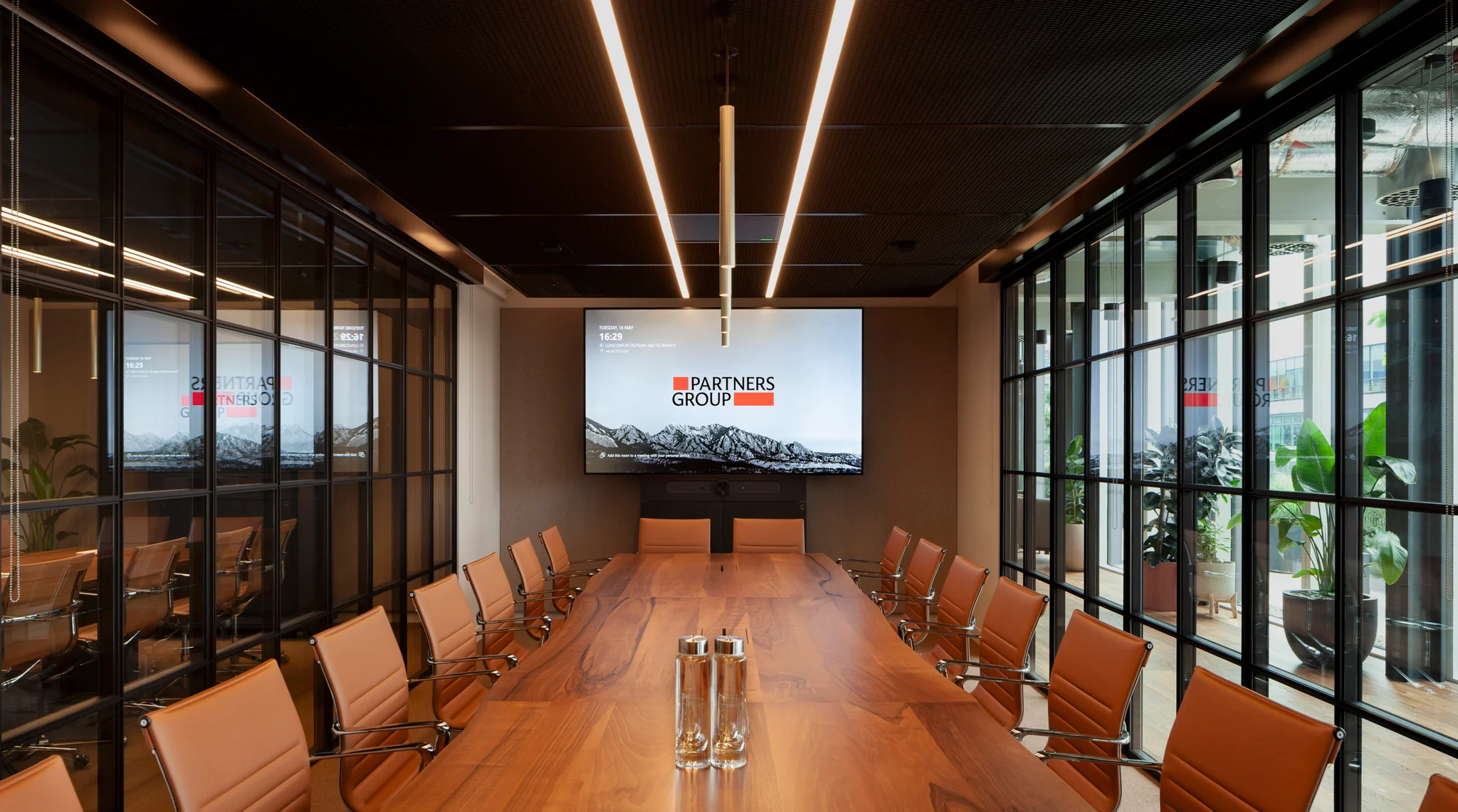
The first room visitors can spot upon entering is the central board room, a slick champagne coloured private pod boasting soundproof walls and huge angled sliding doors, making it feel more like you’re entering the board room at Air Force One than at a North London furniture showroom.


We wanted to split the amount of floor space between the office areas and the shop floor areas as evenly as possible, and we did this following our theme of integrated and seamless spaces by using a raised platform. As a result, we placed a second meeting room directly on top of the first, doubling collaboration space without affecting the size or layout of the showroom.
Exuding more of an industrial feel than its comfy ground floor brother, this meeting space not only ties in with the exposed ceiling to make it feel like you’re in an entirely closed off room, it also acts as a viewing platform to enable visitors to see the entire showroom – and all of its products – clearly from above.
From up here it’s clear to see that the showroom layout has been set up in the style of a lap, flowing from the entrance, through the showroom, round to the samples desk and back out again smoothly and subtly. The central meeting room allows for organized flow of visitors, and the inclusion of multiple different elements on the design floor, such as display cases and statement furniture pieces, ensures that there are no dead corners.

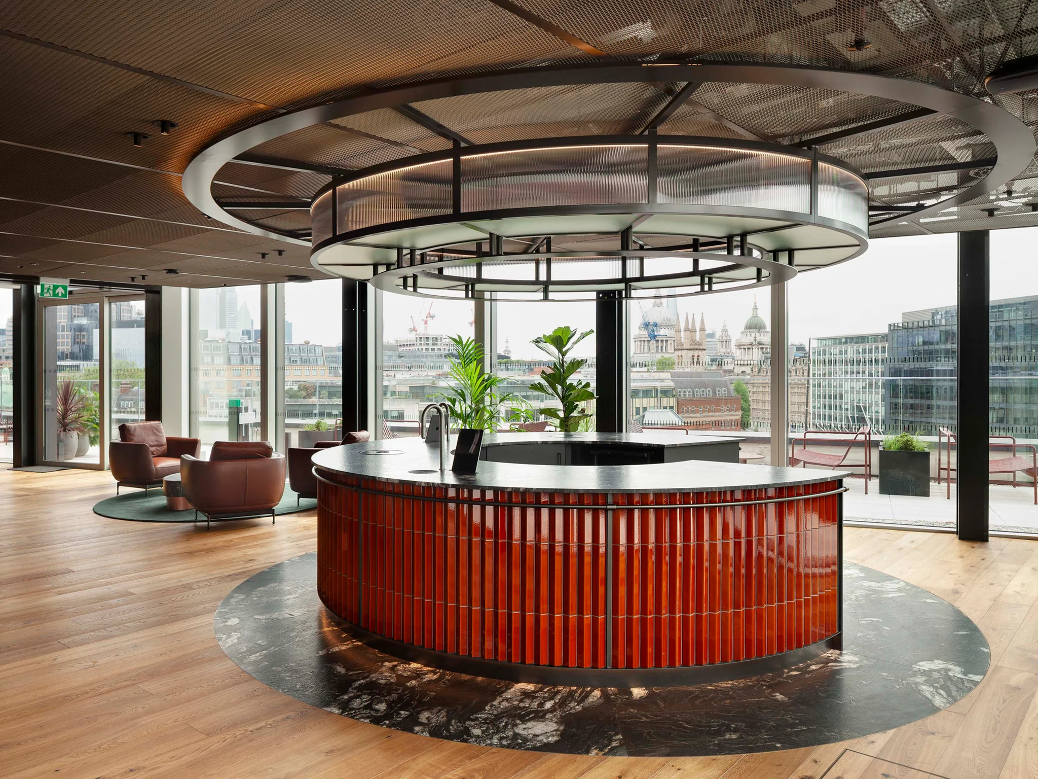
The reflective walls throughout the space help it to feel more spacious and clean, and the continuation of the black glitter work surfaces in the communal kitchen, with its mismatched furniture and sparkling silver appliances, adds a hint of futuristic luxury – especially if you sneak through into the small hidden meeting room complete with giant flat screen TV occupying almost the entire wall.
The Wagstaff showroom is intended to be a unique one-stop shop for everyone from designers and clients to the general public. The huge windows provide a great street presence and the built in technology lining the walls of the reception area make it clear that Wagstaff’s business has been fully integrated into this design.
The organized, professional and innovative display areas allow for maximum flexibility, and mean that the individual sets can be re-arranged as regularly as needed without disrupting the rest of the displays – sort of like a stage set; a theatre showcasing products and ideas.
It was important for us to show off Wagstaff’s products instead of ours with this design, and we managed to do so whilst creating an adaptable concept that will work great for them as a company as and when they decide to expand and grow.

When it comes to grabbing one of our designs it’s becoming more and more obvious that it’s a case of either be there or be square.
To see more images of this project, head to our Facebook or Pinterest profile. If you would like high res images contact us on [email protected]


